Every square foot of your retail space tells a story and guides customer behavior in ways you might not even realize. The layout of your shelving retail shop design doesn’t just determine where products sit—it orchestrates how customers move through your store, what catches their attention, and ultimately, how much they spend. When combined with strategic placement of cash desks and thoughtfully arranged display areas, you create an environment that naturally encourages exploration, engagement, and purchasing.
Understanding customer flow is like understanding choreography. You want customers to move naturally through your space, discovering products along the way, spending enough time to develop buying intent, but never feeling lost or frustrated. The positioning of your shelving creates the pathways. Your cash desk location determines where journeys end. Display areas provide the compelling reasons to pause and consider purchases. When these elements work in harmony, magic happens—customers enjoy their experience and your sales numbers reflect that satisfaction.
The Psychology Behind Customer Movement Patterns
People don’t wander randomly through stores. They follow predictable patterns influenced by psychology, culture, and store design. In most Western countries, customers naturally turn right upon entering a store and move counterclockwise. This isn’t conscious—it’s simply how most people navigate new spaces.
This natural tendency creates prime real estate immediately to the right of your entrance. Placing high-margin products or attention-grabbing displays in this zone capitalizes on customers’ fresh enthusiasm and openness to discovery. They haven’t yet narrowed their focus to specific shopping missions, making them more receptive to impulse purchases.
The “decompression zone” near your entrance deserves special consideration. Customers need a moment to orient themselves when entering—understanding the layout, deciding where to go first, transitioning from outdoor to indoor mindset. Crowding this space with shelving retail shop fixtures or placing your most important displays here wastes valuable real estate because customers aren’t yet mentally present enough to engage.
Speed bumps—strategic placement of displays that slow customer movement—extend dwell time and increase exposure to your merchandise. These aren’t obstacles that frustrate; they’re interesting features that reward slowing down. A well-designed speed bump might be an eye-catching display, an interactive element, or simply a compelling product arrangement that deserves a second look.
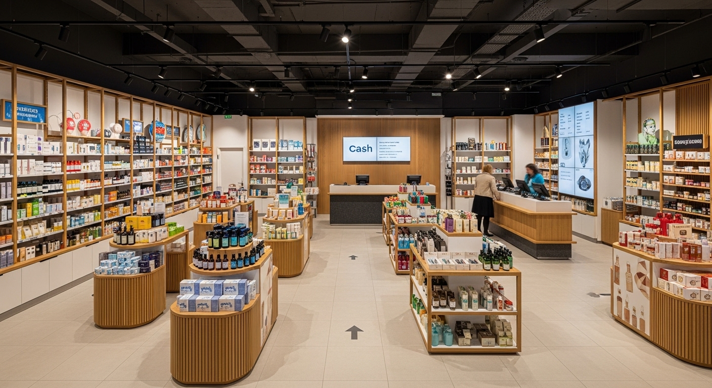
Strategic Shelving Placement That Guides Without Restricting
Your shelving creates the skeleton of your store’s navigation system. Done well, it guides customers naturally through the space while maintaining openness and avoiding the dreaded maze effect that drives shoppers away.
Create clear main aisles that let customers see through your store from multiple vantage points. These sight lines reduce anxiety—customers feel less trapped when they can see exit routes and understand the overall layout at a glance. Visibility also builds interest, as customers spot displays deeper in the store that draw them forward.
Secondary pathways between shelving units should accommodate comfortable browsing without crowding. In stores where customers use baskets or carts, allow generous width for passing. Even in smaller shops without carts, customers appreciate personal space—nothing kills browsing enthusiasm faster than constantly bumping into other shoppers or feeling cramped.
Height variation in your shelving retail shop design creates visual interest and maintains those crucial sight lines. Alternate between taller units on perimeter walls and lower central fixtures. This approach maximizes storage capacity while keeping the space feeling open and navigable. Customers can orient themselves by seeing over lower central shelving to landmarks throughout the store.
Cash Desk Positioning That Optimizes Final Moments
Where you place your cash desk profoundly influences customer experience and your final opportunities to increase basket size. This isn’t a decision to make based solely on convenience for staff—it’s a strategic choice with real revenue implications.
Central cash desk locations create natural circulation patterns as customers approach from various directions. This works well in larger stores where you want to encourage exploration of different departments before checkout. Customers navigate past multiple product categories on their way to pay, increasing exposure and impulse purchase opportunities.
Back-of-store cash desk placement forces customers to walk the entire space before checking out. This maximizes exposure to your full product range and works particularly well when you have confident, compelling merchandising throughout. The risk is that customers in a hurry may feel frustrated by the forced march, so this approach suits stores where browsing is expected and welcomed.
Front cash desk positions near entrances facilitate quick transactions and create psychological ease for customers who value efficiency. However, this placement sacrifices the natural journey through your store. It works best when combined with compelling displays near checkout that capture attention even from customers who came in for specific items and plan to leave quickly.
Creating Display Areas That Pause Customer Movement
Strategic display areas act as destinations within your store—reasons to stop, look, and engage. These shouldn’t be afterthoughts filling leftover space; they’re intentional stopping points in the customer journey.
Feature displays at sight line termination points reward customers who look down aisles. When customers glance down your shelving rows, their eyes naturally land on whatever sits at the end. Making these endpoints visually compelling with special displays, seasonal features, or new arrivals draws customers forward and encourages aisle exploration.
Cluster displays work beautifully for related products. Rather than distributing items across various shelving retail shop locations, group everything for a specific activity or occasion together. Create a “pasta night” display with noodles, sauces, cheese, and wine. Build a “home office” section with all necessary supplies together. This convenience-driven merchandising often results in larger basket sizes as customers grab everything they need from one spot.
Interactive displays increase engagement and dwell time. Whether it’s samples to taste, products to test, or technology to try, hands-on experiences create memorable shopping moments that build product knowledge and purchase confidence. These displays work particularly well in mid-store locations where customers have warmed to browsing and are receptive to discovery.
Managing Bottlenecks and Congestion Points
Nothing disrupts positive customer flow faster than bottlenecks where traffic backs up and browsing becomes uncomfortable. Identifying and addressing these pressure points dramatically improves customer experience and sales performance.
Monitor your space during peak hours to identify where congestion occurs. Is it near popular products where multiple customers gather? Around your cash desk during busy periods? At entry points where incoming and outgoing traffic collides? Each bottleneck has specific solutions, but you can’t fix problems you haven’t identified.
Widen aisles in high-traffic areas, even if it means slightly reducing shelving elsewhere. The increase in comfortable shopping experience and reduced frustration typically outweighs the modest loss of display space. Customers who feel crowded or rushed make fewer purchases and develop negative associations with your store.
Consider adding additional cash desk stations or mobile payment options during peak periods. Long checkout lines not only create immediate frustration—they also discourage customers from browsing longer or returning during busy times. The cost of additional payment processing capacity often pays for itself through retained sales and improved customer satisfaction.
Impulse Purchase Zones Near Checkout
The area surrounding your cash desk represents your final opportunity to increase transaction value. Customers waiting to pay are a captive audience with time to consider one more purchase, and their buying resistance is already lowered by items already in their basket.
Small, affordable impulse items perform brilliantly near cash desks. Candy, magazines, phone accessories, gift cards, and seasonal novelties all work well. Keep items under £5-10 for guilt-free additions that don’t require significant consideration. Display these items at multiple heights from children’s eye level to adult browsing zones, catering to the full demographic spectrum.
Reminder products catch customers before they realize they need them. Batteries, lighters, tissues, pain relievers—these problem-solving items placed near checkout often prompt “oh, I should grab that” moments that boost basket size. They also build appreciation by saving customers a return trip for forgotten necessities.
Limited-time offers or remaining seasonal items find new life in cash desk displays. Customers waiting in line have time to consider whether they want to take advantage of closeout pricing or special promotions. Clear signage highlighting the deal or limited availability creates urgency that drives action.
Balancing Efficiency with Experience
Modern customers want efficiency, but they also value experiences that make shopping enjoyable rather than purely transactional. Your shelving retail shop design must balance these sometimes competing priorities.
Clear category signage helps customers find what they need quickly without asking for help. This efficiency serves goal-oriented shoppers who know what they want, respect their time, and reduce staff interruptions. Position signs prominently at aisle ends and category transitions.
Create pause-worthy moments throughout the store that reward leisurely browsing without penalizing efficient shopping. Customers in a hurry can navigate straight to needed items, while those with more time discover interesting displays and products they didn’t know they wanted. The layout accommodates both shopping styles simultaneously.
Consider the emotional journey you’re creating. Entry areas should feel welcoming and unintimidating. Mid-store sections can be more immersive and engaging. Checkout areas need to feel orderly and efficient, reducing any anxiety about wait times. Each zone serves different psychological needs in the shopping journey.
Adapting Layout for Different Store Sizes
Customer flow principles apply regardless of store size, but implementation varies dramatically between compact shops and expansive retail spaces. Understanding these differences ensures appropriate strategies for your specific situation.
Small stores benefit from perimeter emphasis. Line walls with shelving retail shop fixtures and keep the center relatively open. This maximizes product capacity while maintaining sight lines and avoiding the claustrophobic feeling that drives customers away. Your cash desk in small stores might serve multiple functions—checkout counter, display area, and workspace combined.
Large stores require clear wayfinding and destination creation. Without obvious pathways and compelling reasons to explore, customers may stick to familiar sections and miss significant portions of your store. Create distinct zones with transition markers, use varied fixtures to signal category changes, and position cash desks to encourage circulation rather than quick exits.
Conclusion: Designing Flow That Feels Natural and Drives Sales
Mastering customer flow doesn’t happen by accident—it requires thoughtful planning around how humans naturally navigate retail spaces. Strategic shelving retail shop placement creates pathways that guide without restricting, while carefully positioned cash desks and compelling display areas complete the choreography of an effective retail environment. By understanding psychology, monitoring behavior, and continuously refining your approach, you create spaces where customers enjoy spending time and inevitably spend money. The best designs feel effortless to customers, though they result from careful attention to every element that influences movement and decision-making.
Frequently Asked Questions
How wide should main aisles be in a retail store?
Main aisles should be at least 5-6 feet wide for comfortable two-way traffic without shopping carts, and 6-8 feet wide if customers use carts or wheelchairs. Secondary browsing aisles can narrow to 3-4 feet for single-file traffic. Wider feels more inviting but uses more floor space, so balance openness against display capacity based on your products and typical customer density.
Where is the absolute best location for a checkout counter?
There’s no universal answer—it depends on your store type and goals. Back-of-store locations maximize product exposure, front positions offer convenience, and central locations create natural circulation. Observe your specific customer patterns and priorities. Many successful stores use hybrid approaches with a main checkout and a secondary express station.
How do I know if my current layout is effective?
Track metrics like sales per square foot by zone, average transaction value, dwell time, and conversion rate. Use heat mapping technology or simply observe customer behavior during various time periods. Notice where customers naturally gravitate versus areas they avoid. High-performing layouts show consistent traffic through all areas and strong sales across product categories.
Can I change my layout without major renovation?
Absolutely. Most layout improvements involve relocating or reorganizing existing fixtures rather than structural changes. Start with small adjustments—move a display, widen an aisle, relocate impulse items near checkout—and measure impact before making larger changes. Modular fixtures make reconfiguration easier and more cost-effective.
What’s the biggest layout mistake small retailers make?
Overcrowding spaces with too much merchandise and insufficient circulation space. Small stores particularly need breathing room to avoid feeling cramped. Less product displayed better often outsells more product displayed poorly. Focus on curated selection and comfortable browsing rather than maximum inventory density.
How often should I reconsider my store layout?
Minor adjustments should happen continuously as you identify opportunities or issues. Seasonal resets work well for many retailers—4 times yearly. Major layout overhauls typically make sense every 3-5 years as fixtures age, trends change, and your product mix evolves. Stay responsive rather than locked into rigid arrangements.
Should I design for peak or average traffic levels?
Design primarily for peak traffic. Layouts comfortable during busy periods feel spacious during quieter times—a positive. Layouts optimized for average traffic become uncomfortable nightmares during peak periods, driving away customers exactly when you most want to serve them. Build in capacity for your busiest realistic scenarios.
How do I handle dead zones where customers never go?
Identify why areas aren’t attracting traffic—poor sight lines, inconvenient location, uninteresting products? Solutions might include creating compelling displays in dead zones, improving lighting, widening access paths, or relocating high-demand products there to force traffic. Sometimes accepting limited utility and using dead zones for storage or staff areas makes more sense than fighting inherent limitations.
What role does lighting play in customer flow?
Lighting dramatically influences where customers look and go. Bright, inviting lighting draws customers forward and into areas. Dim areas feel uninviting and get skipped. Use lighting strategically to highlight pathways, feature displays, and create welcoming zones. Avoid creating dark corners or overly bright spots that create uncomfortable glare.
How do I accommodate different shopping missions in one layout?
Create clear pathways for quick shopping while adding interesting displays along routes that reward browsing without blocking efficiency-focused customers. Use vertical space and perimeter locations for discovery-oriented displays that don’t impede traffic flow. The best layouts allow customers to choose their own adventure—quick and purposeful or leisurely and explorative.